Enhancing SaaS PPC Reporting with Automated Dashboards
How to automate SaaS PPC dashboards while keeping the commentary, QA checks, and decisions that make reporting transparent and trustworthy.

A Marketing Operations Specialist finally automates the monthly PPC report. It builds itself now, refreshes overnight, and looks sharp. And somehow it has become less useful than the manual version it replaced.
The old report was slower, but it carried the analyst's notes in the margins. Spend spiked because we tested LinkedIn for two weeks. Cost-per-lead looks worse, but the leads converted to opportunities at twice the rate. We paused the branded campaign on the 14th after the landing page broke. The automated dashboard shows the numbers and none of that thinking. Anyone reading it can see what the metrics are, but not what happened or what to do next.
That is the trap with automated SaaS PPC dashboards that demonstrate the process: automation tends to strip out the human layer that made reporting worth reading. The work was the point, and automation quietly removed it. This article is about building automated dashboards that keep the work visible: the commentary, the decisions, the quality checks, and the next actions, all sitting alongside the numbers. For the wider measurement setup this connects to, our saas analytics hub is the starting point; this piece is about reporting that automates without going dark.
What a PPC dashboard is, and where automation goes wrong
A PPC dashboard is a single view that pulls paid media performance data from your ad platforms, analytics, and ideally your CRM into one place, so a team can see spend, conversions, pipeline, and efficiency without logging into each platform separately. A saas marketing analytics dashboard does the same across the full paid funnel, tying campaign activity to revenue outcomes.
Automation makes that view build and refresh itself. The failure mode is optimising for the wrong goal. When the only target is "no manual work," teams build dashboards that surface clean charts and remove every trace of human judgement. The result looks professional and says almost nothing. A reader sees that cost-per-lead rose 30% and has no idea whether that is a crisis or a deliberate test paying off three weeks later.
For the Marketing Ops persona, this lands on an existing sore spot. The numbers already disagree across platforms. Strip out the commentary that used to explain the discrepancies, and you are left with an automated report nobody fully trusts and everybody quietly double-checks by hand. That is slower than the manual report it replaced.
Why showing the work matters more than the dashboard looking good
Data transparency is what turns a report from a set of numbers into something a revenue team can act on. Integrity in marketing data is not only about the figures being correct. It is about the reader being able to see how a number was derived, what is measured versus estimated, and what changed since last period.
Transparency in data reporting is what builds trust in the numbers, and trust is the whole game. When platform figures conflict, which they always do, a report that openly shows the discrepancy and explains how it was reconciled is more credible than one that hides it behind a single tidy total. Leadership does not need the numbers to be perfect. They need to know the person reporting them understands where they are soft.
The framing that helps here is not automation versus the analyst. It is automation handling the data plumbing so the analyst has time to add the judgement only a human can. Done well, automation does not replace the work. It frees up the hours that used to go on copy-pasting numbers, and those hours go into the commentary that makes the report decision-useful.
The four layers an automated dashboard should still show
The difference between a dashboard that demonstrates the process and one that just displays metrics comes down to four layers most automated reports drop.
- Commentary. Why the numbers moved. A short narrative annotation that explains the spike, the dip, and the context a chart cannot carry on its own.
- Decisions. What you changed and why. A running decision log: campaigns paused, budgets shifted, tests launched, with the reasoning attached.
- Quality assurance checks. What was validated. Data freshness, which figures reconcile to the CRM, what is estimated, and where confidence is lower than usual.
- Next actions. What happens next and who owns it. The report should end by pointing forward, not just summarising the past.
Automate the first job, which is assembling the numbers. Keep the four layers above as the human contribution. A dashboard carrying all five is genuinely useful to a revenue team; one carrying only the numbers is a screensaver.
Building data integrity into automated PPC reporting
Quality assurance checks in reporting are what stop an automated dashboard from confidently displaying wrong numbers. Automation removes manual effort, but it also removes the manual sense-check that used to catch the obvious errors, so the QA has to be built into the pipeline rather than left to a person noticing.
A practical QA layer for data integrity in marketing covers a few things:
- Reconciliation. Platform-reported conversions almost always overstate reality, because each platform claims credit for the same outcome. Reconcile ad platform numbers against analytics and against the CRM, and show the gap rather than picking whichever number looks best.
- Freshness flags. Mark when each data source last refreshed. A dashboard quietly running on three-day-old LinkedIn data is worse than one that flags the lag.
- Anomaly flags. Automatic alerts when spend, conversions, or cost-per-acquisition move beyond a normal range, so the analyst investigates before the report goes out, not after a stakeholder asks.
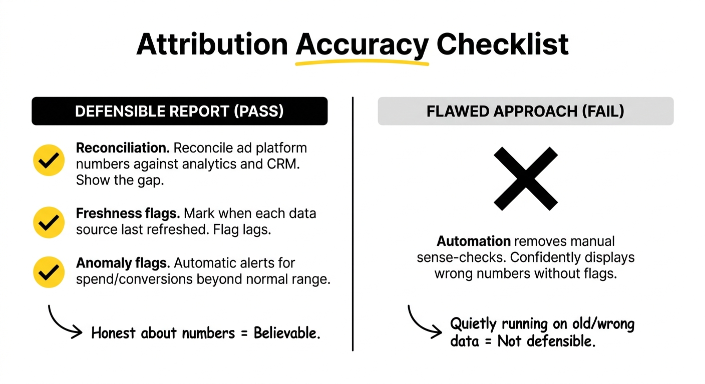
This is the heart of the Marketing Ops role: aligning attribution, tracking, and CRM so the numbers tell a consistent story. Good measurement and attribution strategies depend on the dashboard being honest about which numbers are solid and which are directional. Showing that openly is not a weakness in the report. It is the thing that makes the rest believable.
.jpg)
Integrating your MarTech stack without breaking the pipeline
Most reporting pain traces back to data living in separate systems that never quite agree. Integrating MarTech stacks for reporting means building one pipeline from ad platforms through to a dashboard, reconciled against the CRM as the source of truth.
The shape of that pipeline depends on how many platforms you run and whether you have data resources. There is no single right answer, only a right answer for your stack size.
- One to two platforms: native platform reports plus analytics. Best for small spend that is mostly Google.
- Three to five platforms: a connector feeding a BI tool such as Looker Studio. The highest-return tier for automation.
- Many platforms with data resources: a connector into a warehouse, then a BI layer on top, for custom modelling and large volume.
- B2B and revenue-focused: a revenue attribution platform tied to the CRM, for proving pipeline rather than form fills.
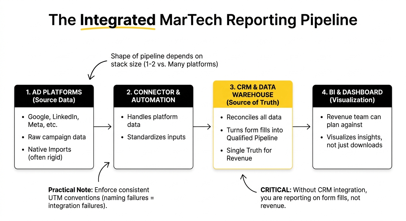
For B2B SaaS, the feature that decides whether reporting tells the truth is CRM integration. Without it, you are reporting on form fills and downloads rather than qualified pipeline and revenue, and a beautiful dashboard built on form fills is a confident way to be wrong. Connector tools handle the platform data well, but the CRM connection is what turns ppc dashboard automation tools into something a revenue team can plan against.
Two practical notes. Enforce consistent UTM conventions, because most integration failures are really naming failures. And do not over-trust the newer native imports between ad platforms and analytics; they tend to be rigid about matching and cannot clean messy campaign names, so they often need a connector alongside them anyway. Governance gets harder as teams grow, which we cover separately in our piece on reporting tools for large SaaS teams with proper governance.
Automating without losing the human touch
The differentiator worth holding onto is the balance between automation and judgement. Marketing operations automation should handle assembly, scheduling, and refresh. It should not be trusted to interpret.
In practice, that means designing the dashboard so the human layer has a home. Put a narrative text block at the top of the dashboard for this period's commentary. Keep a decision log table that the analyst updates. Reserve a panel for QA status and a section for next actions. Then schedule delivery, but keep a human review step before anything goes to stakeholders.
The position worth taking: the best automated report is not the one a human spends zero minutes on. It is the one a human spends fifteen minutes on, because automation did the two hours of assembly first. Automated reporting best practices are not about removing people from the loop. They are about removing the drudgery so the people add the part that matters.
A practical plan for enhancing marketing operations
Here is a sequence for putting this in place without disrupting everything at once.
- Map your data sources. List every platform, your analytics, and your CRM, then pick the integration approach that matches your stack size from the list above.
- Reconcile to the CRM. Make the CRM the source of truth and build reconciliation against it into the pipeline, not into someone's memory.
- Design the dashboard with the human layers built in. Commentary block, decision log, QA panel, and next-actions section, before you touch a single chart.
- Build the QA checks. Reconciliation, freshness flags, and anomaly alerts that run automatically.
- Schedule delivery with a review step. Automate the build and the send, but keep a human checkpoint between them.
- Review and evolve quarterly. Dashboards drift as campaigns and stacks change. Revisit what the report shows and what it should.
None of this requires ripping out your existing tools. It requires deciding that the report exists to drive decisions, not to look finished. That single decision is what separates a dashboard that gives revenue teams real insight from one that gets glanced at and ignored.
If you are working through this, automated reports that technically work but no longer explain anything, this is the kind of setup we build with SaaS Marketing Ops teams regularly. Worth a conversation if you are at that point.
Frequently Asked Questions
What is a PPC dashboard and how does it benefit Marketing Operations Specialists?
A PPC dashboard is a single view that consolidates paid media data from ad platforms, analytics, and the CRM, so performance can be seen without logging into each system. For Marketing Operations Specialists, it removes hours of manual consolidation, reduces the discrepancies that come from copying numbers by hand, and creates one consistent version of performance that the whole revenue team can work from.
How can automated PPC dashboards improve data integrity and transparency?
They improve integrity by applying the same reconciliation and validation logic every time, rather than relying on a person to remember the checks. They improve transparency when they show how numbers were derived, which figures reconcile to the CRM, and what is estimated. Automation enforces consistency; the transparency comes from deliberately surfacing the workings rather than hiding them behind a single total.
What key features should be included in an automated PPC dashboard for SaaS?
Beyond the standard spend, conversion, and efficiency metrics, a SaaS dashboard needs CRM-connected pipeline and revenue data, a commentary area for narrative, a decision log, a QA panel showing data freshness and reconciliation status, and a next-actions section. The CRM connection is the most important; without it the dashboard reports form fills rather than qualified pipeline.
How do you ensure quality assurance in automated PPC reporting?
Build the checks into the pipeline. Reconcile platform numbers against analytics and the CRM and show the gap, flag when each data source last refreshed, and set anomaly alerts for unusual movements in spend or conversions. The goal is for the dashboard to catch and surface problems automatically, so the analyst reviews flagged issues rather than manually hunting for them.
What are the common challenges when implementing PPC dashboards in SaaS?
The usual challenges are siloed data across platforms, numbers that do not reconcile, inconsistent UTM naming that breaks integrations, and missing CRM connection that limits reporting to form fills. There is also the cultural risk of automating away the commentary and judgement, which leaves a report that runs itself but no longer helps anyone decide anything.
How can commentary and decision-making processes be integrated into automated reports?
Design space for them. Add a narrative text block at the top of the dashboard for period commentary, maintain a decision log table that records what changed and why, and keep a review step before delivery where the analyst adds context. Automation handles assembly and scheduling; the human fills the commentary and decision layers during a short review rather than rebuilding the report.
What role does MarTech integration play in PPC dashboard effectiveness?
It determines whether the dashboard can tell the truth. Integrating ad platforms, analytics, and especially the CRM into one reconciled pipeline is what lets a B2B dashboard show pipeline and revenue rather than just platform metrics. Weak integration produces dashboards that look complete but report on the wrong outcomes, which is worse than no dashboard because it is confidently misleading.
How can automated PPC dashboards support measurement and attribution strategies?
By bringing platform data and CRM outcomes into one reconciled view, they make attribution analysis possible rather than theoretical. A dashboard that ties spend to pipeline by channel and shows where platform-reported conversions diverge from CRM reality gives the foundation that measurement and attribution strategies need. The dashboard does not replace an attribution model, but it supplies the clean, consistent data the model runs on.
What are best practices for showcasing the underlying work in PPC reporting?
Keep the four human layers visible: commentary explaining why numbers moved, a decision log, QA status showing what was validated, and next actions. Show discrepancies and how they were reconciled rather than hiding them. Automate the assembly so a person has time to add interpretation. The aim is a report a reader can act on, not one that merely looks finished.
How can revenue teams use insights from automated PPC dashboards for decision-making?
Revenue team insights come from a dashboard that pairs numbers with context and points forward. When the report shows not just what happened but why, what was changed, how confident the data is, and what to do next, a revenue team can make budget and strategy decisions directly from it. Without that context, the dashboard informs nobody and every decision still requires a separate conversation.