Essential Messaging Blocks for High-Performance SaaS PPC Landing Pages
A block-by-block breakdown of high-performance SaaS PPC landing pages: hero, proof, objection handling, qualification, and CTA, plus how to test them.

A high-performance SaaS PPC landing page is not written in one pass. It is assembled from blocks, each with a specific job: grab the right visitor, prove you can help, answer the doubt in their head, filter for fit, and make the next step obvious. Get the blocks right and the page converts. Get them in the wrong order, or leave one out, and even excellent copy leaks conversions.
This is a breakdown of the high-performance SaaS PPC landing page content sections that actually move the needle, and the role each one plays. For a performance-driven marketing manager who wants actionable insight rather than generic advice, thinking in blocks is what makes a page fast to build, fast to test, and easy to diagnose when a number dips. Effective SaaS PPC landing page messaging components are modular by design, so you can improve one without rebuilding the whole page.
We will work through the five essential blocks, how to map them to buyer intent, and how to test them. These are the PPC landing page messaging best practices that separate pages clearing 10% conversion from the median SaaS page stuck near 3.8%.
What high-performance messaging blocks are
A messaging block is a discrete section of a landing page with a single persuasive job, arranged so the blocks together carry a visitor from arrival to conversion.
Thinking in blocks is different from thinking about design or about copy craft. Design decides how a page looks. Copywriting, which we cover in our guide to turning ICP pain into demo intent, decides how each line reads. Messaging blocks sit between the two: they are the structural anatomy, the sequence of jobs the page has to do in order.
Every high-converting SaaS PPC page runs roughly the same block sequence:
- Above-the-fold: orient the right visitor in five seconds.
- Proof: show you have done this for people like them.
- Objection handling: remove the specific doubt holding them back.
- Qualification: help the wrong visitor leave and the right one lean in.
- Call to action: make one next step unmissable.
The order matters because it mirrors how a buyer decides: relevance first, then trust, then feasibility, then commitment. Ask for the commitment before you have earned the trust and conversion quality drops regardless of how much traffic you send.
The five essential messaging blocks
Above-the-fold: the hero block
The hero decides whether a visitor scrolls or bounces, and you have about five seconds. A strong hero has four parts: an outcome-focused headline, a subheadline that adds an audience qualifier and the mechanism, a primary call to action with a friction reducer, and a product visual that shows the thing in context.
The headline should name the outcome, not the category. “Cut reporting time by 60%” beats “Powerful analytics platform.” The subheadline then qualifies who it is for and how it works, which begins filtering for fit before the visitor has scrolled. Critically, the hero has to match the ad that produced the click. A visitor who arrived on a specific promise and lands on a generic homepage-style hero feels the disconnect and leaves. Since roughly two-thirds of SaaS landing page traffic is now mobile, the hero and its CTA must render above the fold on a phone, not just a laptop.
Proof: the evidence block
Once the hero has earned attention, the next question in the visitor's head is “can I trust you?” The proof block answers it. The pattern that works in 2026 is layered proof, not a single testimonial dump. Early proof can be recognisable customer logos and high-level trust indicators. Mid-page proof should speak to practical doubts like setup effort and reliability. Late proof, near the decision, should address commitment concerns such as support and implementation.
Specificity is everything. Named logos with context (“trusted by 2,400 RevOps teams”), role-identified testimonials tied to a result, and a bar of three or four verifiable numbers all outperform vague claims. One precise proof point that matches the buyer's concern beats a dozen generic quotes, and proof placed next to the call to action cuts hesitation at the exact moment of decision.
Objection handling: the reassurance block
Every buyer arrives with a specific reason not to convert. The objection-handling block surfaces those reasons and answers them before they harden into a bounce. Common SaaS objections cluster around switching cost, security and compliance, implementation effort, and price.
Handle them in the copy and with trust cues placed where the doubt occurs. Security-conscious buyers look for SOC 2 and GDPR badges, so put them near the form rather than in the footer. Risk reducers like “no credit card required” or “cancel anytime” are objection-killers precisely because they sit at the point of commitment. This is where objection handling techniques earn their keep: a single line of reassuring microcopy beside the button can lift completion more than a redesign.
Qualification: the fit block
Not every click should convert. The qualification block uses copy to help poor-fit visitors self-select out and strong-fit visitors lean in, which protects lead quality and keeps sales focused. Stating plainly who the product is for (“built for B2B SaaS teams scaling past their first sales hires”) does more for lead quality than any hidden form filter.
Qualification also means routing by readiness. A visitor who wants to explore and one who is ready to buy need different next steps, and segment-specific messaging, serving ICP-relevant variants to different audiences, has been shown to cut bounce and lift conversions materially. Good qualification is a quiet lead generation tactic: fewer, better leads beat more, worse ones every time.
Call to action: the conversion block
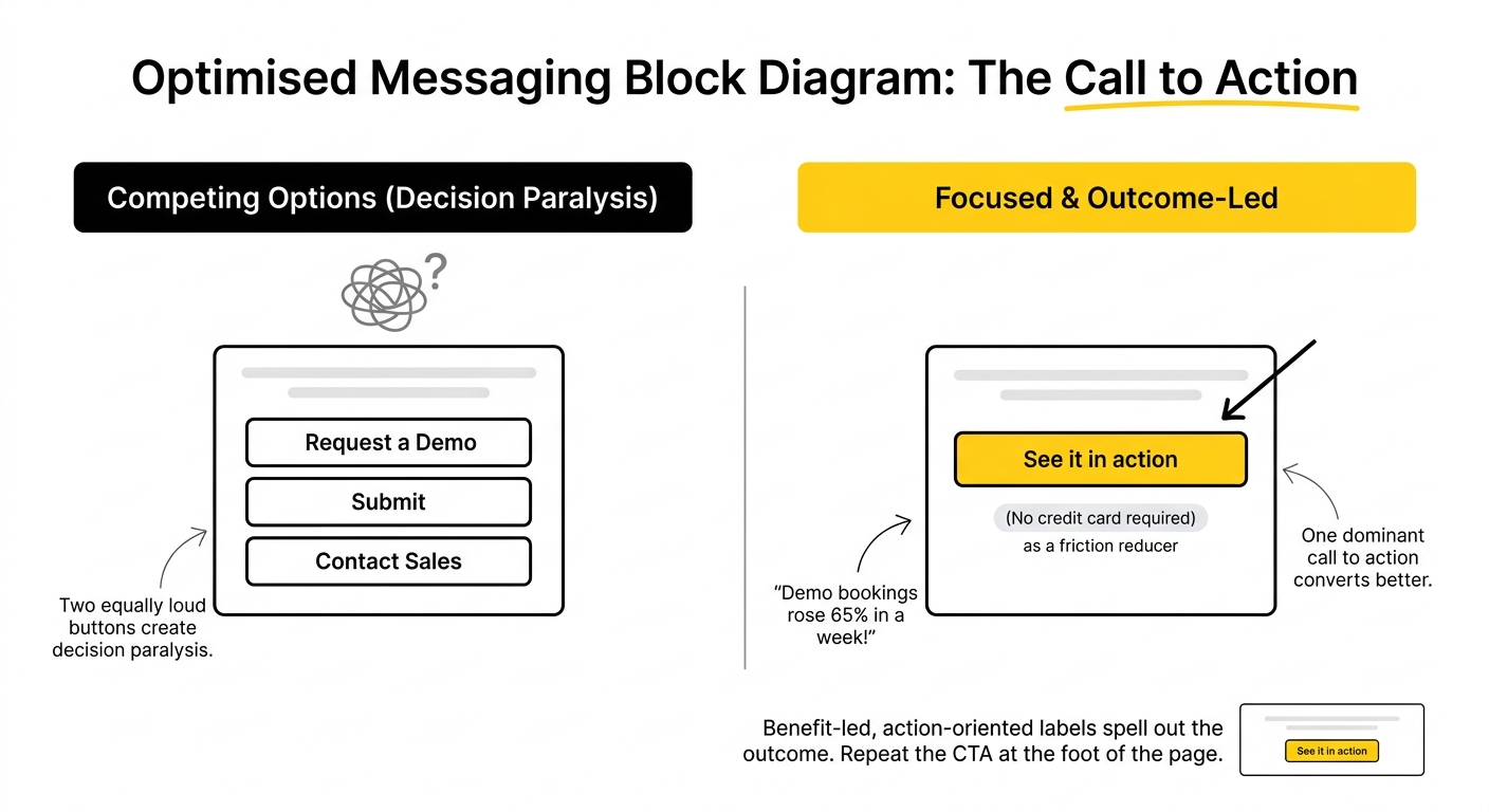
The CTA block is where interest becomes a lead, and the rule is focus. One dominant call to action, repeated down the page, converts better than several competing options, because two equally loud buttons create decision paralysis. Where a secondary action exists, give it reduced visual weight.
The copy on the button should spell out the outcome. Benefit-led, action-oriented labels (“See it in action,” “Start in 30 seconds”) beat generic “Submit” or “Request a demo.” The impact is real: one cybersecurity SaaS moved its CTA above the fold and switched to outcome-led copy, and demo bookings rose 65% in a week. Pair the button with a friction reducer and repeat the CTA at the foot of the page for visitors who scroll all the way down.
Mapping messaging blocks to buyer intent
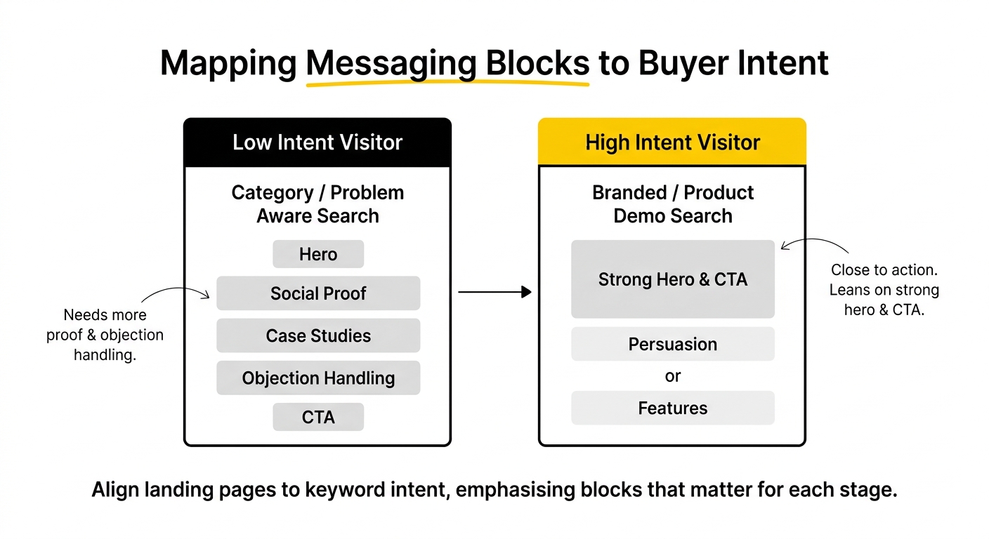
The same five blocks are not weighted equally on every page. High-converting PPC campaign strategies separate intent levels and adjust the blocks to match. A visitor from a branded “product name plus demo” search is close to action, so the page can lean on a strong hero and CTA with lighter persuasion. A visitor from a category or problem-aware search needs more proof and objection handling before they are ready to commit.
Lumping mixed intent onto one page drags down performance. The practical move is to align each campaign's landing page to the commercial temperature of its keyword, emphasising the blocks that matter for that stage. This is the difference between a page that technically contains all five blocks and one that sequences them for the specific visitor a campaign sends. It is also core to sound B2B marketing strategies, since it ties every pound of paid spend to a page built for that buyer. For how these pages sit within a broader funnel, our saas landing pages hub maps the full picture.
Testing and iterating: turning blocks into a system
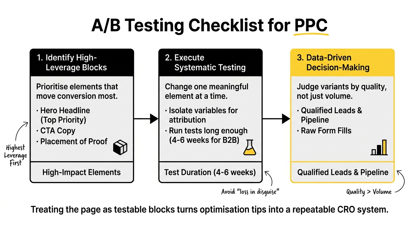
The block model's biggest advantage is that it makes testing systematic. Rather than guessing, you test the highest-leverage blocks first, and data-driven decision-making tells you what to keep. In priority order, the elements that move conversion most are the hero headline, the CTA copy, and the placement of proof. These matter far more than button colours.
Change one meaningful element at a time so you can attribute the result, and run each test long enough to trust it, typically four to six weeks on B2B traffic. Judge variants by qualified leads and pipeline, not raw form fills, because a variant that lifts volume while lowering quality is a loss in disguise. For the deeper principles behind conversion-focused copy that these tests refine, our 2021 Guide to Conversion-Focused SaaS Copywriting still holds up well. Treating the page as a set of testable blocks is what turns landing page optimisation tips into a repeatable conversion rate optimisation system.
Common mistakes to avoid
A handful of errors show up on most underperforming pages:
- A weak or generic hero. If the headline names the category instead of the outcome, the visitor cannot orient in five seconds.
- Ad-to-page message mismatch. The promise that earned the click is missing from the hero.
- Vague proof. “Trusted by thousands” persuades no one; specific, attributed proof does.
- Objections left unanswered. No security badges, no risk reducers, no reassurance where the doubt lives.
- Competing CTAs. Several equally weighted actions split intent and lower conversion.
- Optimising to form fills. Chasing volume over qualified pipeline trains campaigns on the wrong signal.
If you want a second view on which blocks are leaking conversions on your own pages, that is the kind of work we do with SaaS teams regularly.
Frequently Asked Questions
What are the key messaging blocks for high-performance SaaS PPC landing pages?
The five essential blocks are the above-the-fold hero, proof, objection handling, qualification, and the call to action. The hero orients the right visitor in seconds, proof builds trust, objection handling removes specific doubts, qualification filters for fit, and the CTA makes one next step obvious. Sequencing them in that order matters because it mirrors how buyers decide: relevance, then trust, then feasibility, then commitment.
How can above-the-fold content impact conversion rates on SaaS landing pages?
The hero decides whether a visitor scrolls or bounces, usually within five seconds. An outcome-focused headline, a subheadline that names the audience and mechanism, a primary CTA with a friction reducer, and a product visual in context all work together to orient the right visitor fast. Because most SaaS traffic is now mobile, the hero and CTA must appear above the fold on a phone, not just a desktop, to avoid losing paid clicks.
What role do proof elements play in enhancing trust on SaaS landing pages?
Proof answers the buyer's unspoken “can I trust you?” The strongest approach is layered proof: recognisable logos early, practical reassurance mid-page, and commitment-focused evidence near the decision. Specificity carries the weight, so named logos with context, role-identified testimonials tied to results, and a few verifiable numbers outperform vague claims. Proof placed next to the call to action reduces hesitation at the exact moment of commitment.
How can objection handling improve lead quality on SaaS PPC landing pages?
Objection handling surfaces the specific reasons a buyer might not convert, switching cost, security, implementation effort, price, and answers them before they cause a bounce. Placing trust cues like SOC 2 and GDPR badges near the form, and risk reducers such as “no credit card required” beside the button, removes doubt at the point of decision. Answering real objections attracts committed buyers and filters out hesitant, low-intent ones.
What are effective calls to action for SaaS landing pages?
Effective CTAs are focused and outcome-led. Use one dominant call to action, repeated down the page, rather than several competing buttons that cause decision paralysis. The copy should spell out the benefit, so “See it in action” or “Start in 30 seconds” beats “Submit.” Pair the button with a friction reducer, give any secondary action reduced visual weight, and repeat the CTA at the foot of the page.
What data-driven strategies can optimise SaaS PPC landing page performance?
Test the highest-leverage blocks first: the hero headline, the CTA copy, and proof placement, since these move conversion far more than cosmetic changes. Change one meaningful element at a time to attribute results, and run each test for four to six weeks on B2B traffic to reach significance. Judge variants by qualified leads and pipeline rather than raw form fills, so you optimise for revenue rather than vanity volume.
How can B2B marketing managers implement continuous improvement techniques for landing pages?
Treat the page as a set of testable blocks rather than a fixed asset. Run a disciplined test on one block, measure the result against qualified pipeline, feed the learning into the next hypothesis, then test again. Prioritise the blocks with the most leverage, document what each test teaches, and carry that insight into future pages. This turns landing page optimisation from occasional guesswork into a repeatable system.
What metrics should be tracked to measure the success of SaaS landing pages?
Track conversion rate benchmarked against your vertical rather than a blended average, lead quality measured by MQL-to-SQL conversion, bounce rate as an intent signal, and cost per qualified lead to connect the page to acquisition cost. Form-fill volume alone is misleading, since it can rise while quality falls. Attaching context, segment, traffic source, and funnel stage, is what makes any of these numbers actionable.
How does the design of a landing page affect user experience and conversions?
Design and messaging work together. Even strong blocks fail if the page is slow, cluttered, or hard to use on mobile, where most SaaS traffic now originates. Clear visual hierarchy helps the eye move through the blocks in order, proof and CTAs need to render above the fold on a phone, and page speed itself signals product quality to buyers evaluating mission-critical tools. Good design makes the messaging blocks legible and fast to act on.
What common mistakes should be avoided when creating SaaS PPC landing pages?
The frequent ones are a generic hero that names the category instead of the outcome, an ad-to-page message mismatch, vague proof, unanswered objections, and several competing CTAs that split intent. The subtlest and most costly is optimising to form fills rather than qualified pipeline, which trains campaigns on the wrong signal. Building the page as sequenced, testable blocks is the surest way to avoid all of these.