Enhancing SaaS Landing Page UX: Reduce Friction Without Compromising Messaging
How to run SaaS landing page UX experiments that reduce friction through form flow, clarity, and trust signals without diluting the messaging that qualifies buyers.

“Remove friction” is the most repeated advice in conversion optimisation, and the most dangerous when applied bluntly. Cutting a long form to a few fields can lift conversion by more than 100%, which sounds like an easy win until you notice the qualifying question you dropped was the one keeping unqualified leads out of the pipeline. Conversion goes up, lead quality goes down, and your cost per customer quietly climbs.
That is the tension at the centre of landing page UX experiments for SaaS. The goal is not to strip every obstacle from the page. It is to reduce friction in landing pages that blocks good-fit buyers, while protecting the messaging and qualification that make a lead worth having. For a Head of Growth balancing product-led and sales-led motions, that balance is the whole game, because the wrong friction cut damages acquisition efficiency even as the dashboard looks better.
This guide covers how to run UX experiments for landing pages that lessen friction without diluting SaaS messaging: which friction to cut and which to keep, the three levers that do it, how to preserve message integrity while simplifying, and how to measure the result against the metrics that actually matter.
What a friction-reducing UX experiment is
A friction-reducing UX experiment is a structured test of a change to form flow, page clarity, or trust signals, designed to make a landing page easier to act on without weakening the message that communicates value and qualifies the buyer.
Improving SaaS messaging through UX design works through a small set of moves:
- Simplify form flow so completing it feels effortless, without discarding the fields sales genuinely needs.
- Sharpen page clarity so the core message lands faster, not so it says less.
- Place trust signals where doubt occurs, reducing hesitation without cluttering the page.
- Test each change for statistical significance before scaling it.
The discipline is treating friction reduction and message integrity as a single problem, not two competing goals.
The friction paradox: not all friction is bad
The instinct to remove every barrier misses a distinction. Some friction is unproductive: slow load times, cluttered layouts, confusing navigation, redundant form fields, an unclear call to action. That friction costs you good-fit buyers for no benefit, and removing it is pure upside.
Other friction is productive. A qualifying question, a moment of commitment, a clear statement of who the product is and is not for, all of these add a small amount of effort, and that effort is doing useful work. It filters out poor-fit visitors before they become leads sales will waste time on. Strip it in the name of a cleaner page and you lift form fills while lowering the quality of what those forms produce.
This is why UX experiments cannot be judged on conversion rate alone. A change that removes productive friction can raise conversion and raise your customer acquisition cost at the same time, because the extra conversions never reach qualified pipeline. The skill is telling the two kinds of friction apart.
Reduce the friction that blocks, keep the friction that qualifies
Telling them apart comes down to one question: is this element doing useful work, or just getting in the way?
Cut friction that only adds effort:
- Non-essential form fields that exist for internal convenience rather than qualification or routing.
- Slow pages. Speed is a conversion variable, and mobile load times on unoptimised pages routinely run several seconds too long.
- Cluttered layouts and competing calls to action that force the visitor to make several decisions at once.
- Vague or clever copy that makes the reader work to understand what you do.
Keep the friction that earns its place:
- The one qualifying question that tells sales who they are talking to.
- Fit framing that helps a poor-fit visitor self-select out.
- The commitment a genuine buyer is willing to make, such as booking a real meeting rather than a low-intent download.
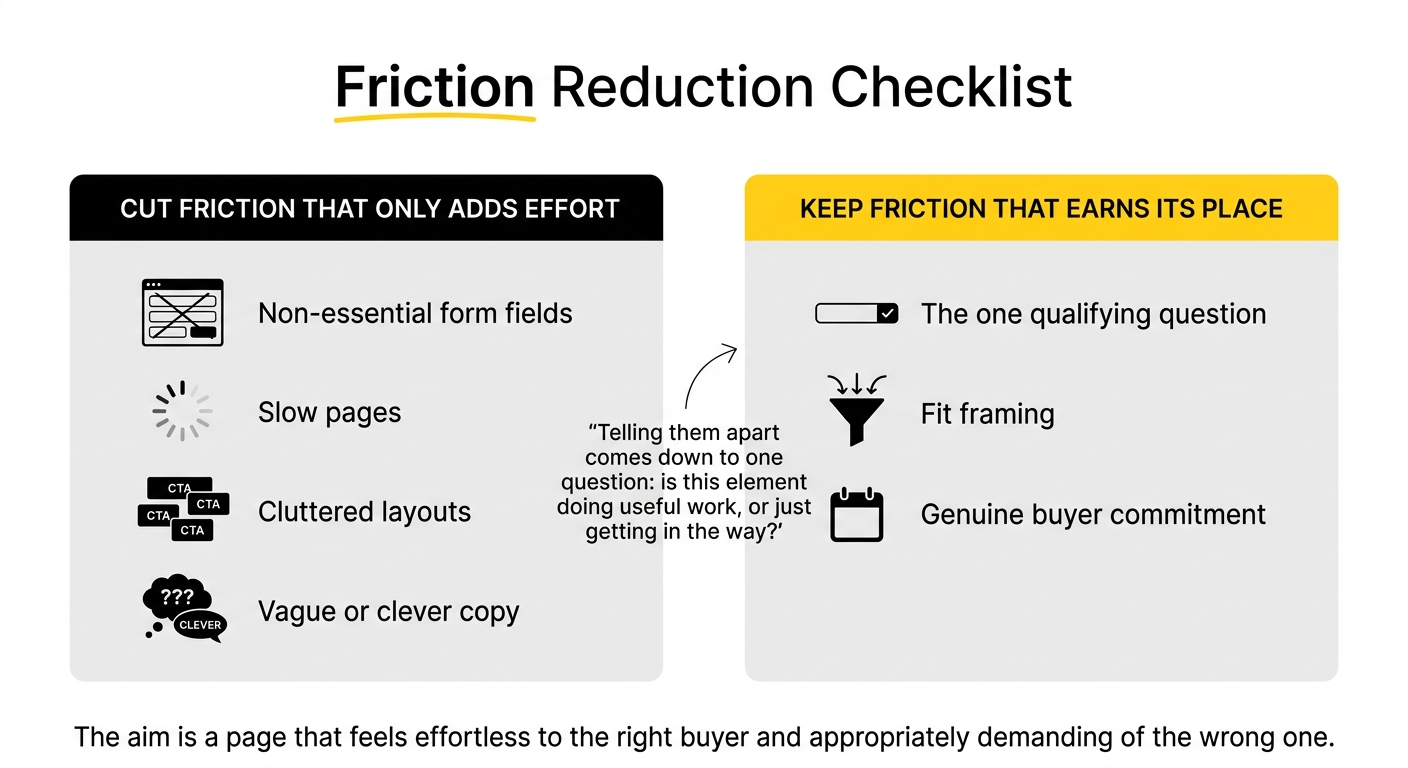
The aim is a page that feels effortless to the right buyer and appropriately demanding of the wrong one.
Three UX levers that cut friction without cutting the message
Form flow
Forms are where conversion intent meets friction most directly, and where the paradox bites hardest. Cutting fields lifts completion, reducing a long form to a few essentials has produced conversion gains well over 100% in aggregate testing, but blunt field-stripping can also remove the data that qualifies a lead.
The resolution is progressive, multi-step forms. Open with a low-friction question that earns a micro-commitment, then ask for contact details once the visitor is mentally invested. Progressive profiling lets you collect the rest over later interactions rather than demanding everything up front. This is how you reduce perceived friction and preserve lead quality at once, so form flow optimisation stops being a trade-off. The test to justify every field: does it earn its place through qualification or routing value, or is it there for internal convenience?
Page clarity
Clarity reduces cognitive friction, the effort of understanding. The move is to make the message land faster, not to say less. One dominant idea per section, a clear visual hierarchy that guides the eye, and a headline a visitor grasps in seconds all reduce the work of comprehension while leaving the message intact. Clarity of offer and message-to-intent match are among the few levers that reliably move conversion, so this is where UX and messaging reinforce each other rather than compete. Simplifying how something is said is not the same as diluting what is said.
Trust signals
Trust signals reduce the friction of doubt. Placed well, they answer the buyer's hesitation exactly where it arises: a recognisable logo near the headline, a specific proof point beside the value proposition, a security badge next to the form. Placed badly, they become clutter that adds visual noise. The experiment is not “more trust signals” but “the right signal at the right point of doubt,” which builds credibility without weighing the page down.
Preserving messaging while you simplify
The failure mode to guard against is simplification that quietly hollows out the message. A SaaS landing page is closer to a product experience than a generic e-commerce page: the message has to communicate value, establish fit, and qualify, all of which take some words and some structure. Cut too far in pursuit of a minimal, frictionless page and you can end up with something clean, fast, and unpersuasive.
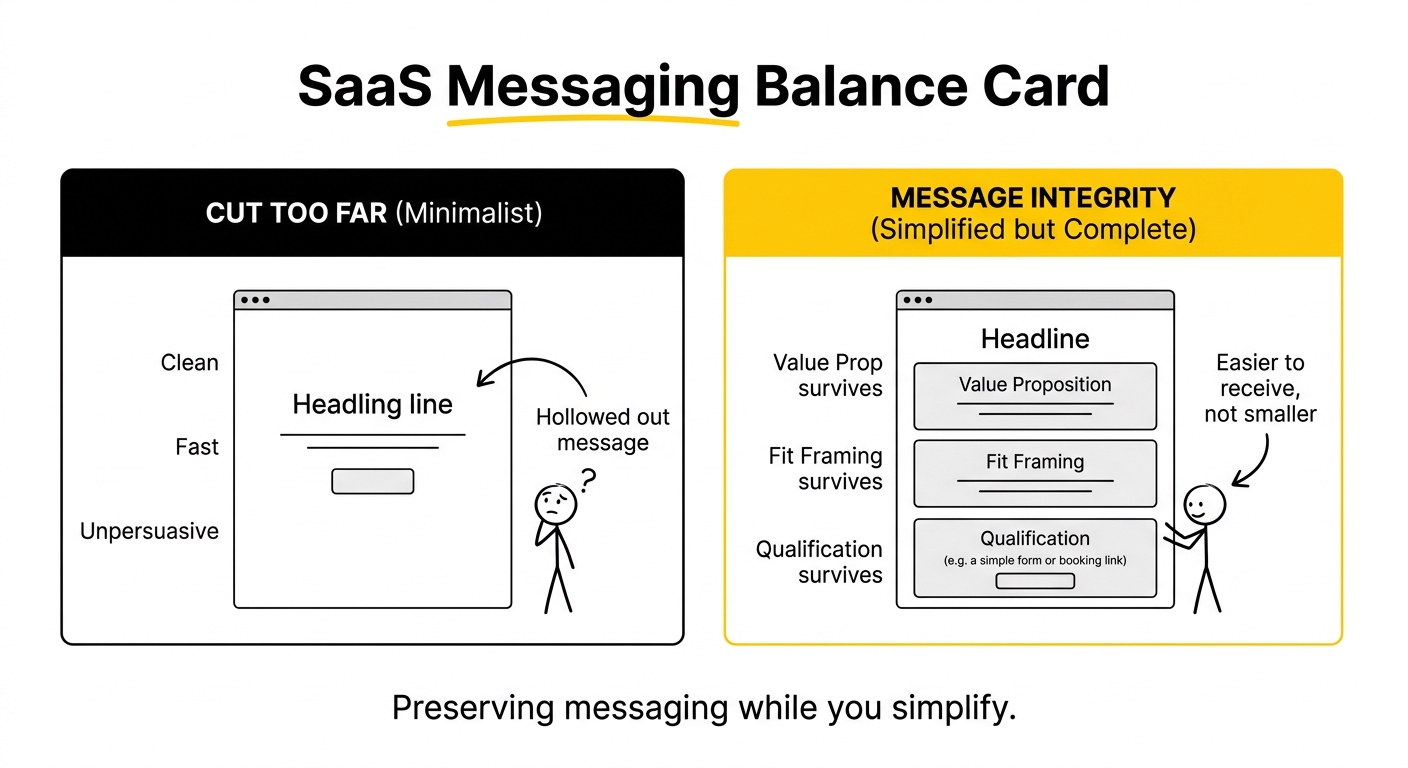
Message integrity means the value proposition, the fit framing, and the qualification survive every simplification. When you remove an element, ask whether it was carrying message weight before you delete it. Often the better move is to express the same message more clearly rather than to remove it. The best UX experiments make the message easier to receive, never smaller.
Running the experiments: structure and significance
UX changes are hypotheses, and they earn their place through structured experimentation, not opinion. Change one meaningful element at a time so you can attribute the result, and hold each test to statistical significance before you scale it, since acting on noise is how teams convince themselves a message-diluting change was a win. Learning velocity matters, but velocity without rigour just produces confident mistakes faster.
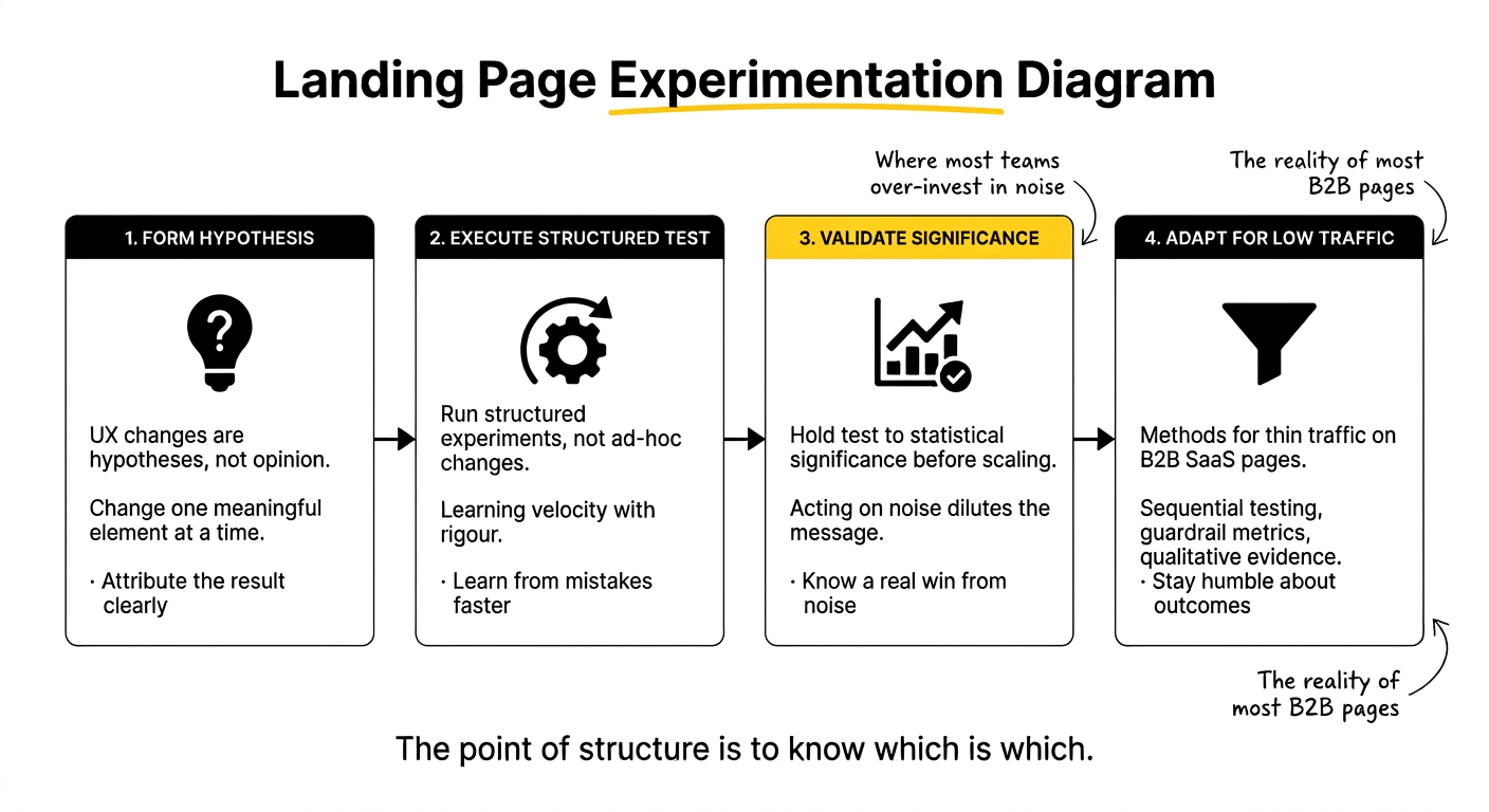
Where traffic is too thin for classic significance, which is most B2B SaaS pages, use the methods suited to it, sequential testing against a baseline, guardrail metrics, and qualitative evidence, which we cover in our guide to low-traffic CRO iterations. And stay humble about outcomes: sometimes the change you were certain about does nothing, and sometimes an accident reveals more than a planned test, as in this account of how a bug skyrocketed conversions. The point of structure is to know which is which.
Measuring beyond conversion: CAC and LTV:CAC
Because reducing the wrong friction can lift conversion while harming quality, a UX experiment has to be judged past the form fill. Tie each test to downstream outcomes: MQL-to-SQL rate for the leads it produces, cost per qualified opportunity, and ultimately its effect on acquisition efficiency. A change that lifts conversion but worsens your CAC ratio is a loss, however good the top-line number looks.
For a dual-motion team, the outcomes differ by path. On the product-led side, watch activation, whether new signups reach first value, not just signup volume. On the sales-led side, watch qualified pipeline and the LTV:CAC it generates. Robust attribution across both is what lets you connect a UX change to acquisition rather than guessing. Measured this way, friction reduction becomes a lever for efficient growth rather than a vanity exercise, and it pairs naturally with a broader set of conversion rate optimisation services aimed at the same goal.
Common mistakes to avoid
A handful of errors turn friction reduction into a quality problem:
- Stripping qualifying fields for a shorter form. Higher completion, lower lead quality, worse CAC.
- Judging UX experiments on conversion alone. Ignoring the downstream pipeline effect where hidden cost lives.
- Simplifying the message, not just the design. Cutting words that were carrying value or fit framing.
- Adding trust signals as clutter. More badges rather than the right signal at the point of doubt.
- Scaling on noise. Calling a winner before the test reaches significance.
- Ignoring page speed. Treating a conversion variable as an engineering afterthought.
If you want a second view on which friction to cut and which to protect on your own pages, that is the kind of work we do with SaaS growth teams regularly.
Frequently Asked Questions
What are effective strategies to reduce friction on landing pages?
Cut the friction that only adds effort: non-essential form fields, slow load times, cluttered layouts, competing calls to action, and vague copy. Use progressive, multi-step forms to lower perceived effort while keeping the data sales needs, sharpen page clarity so the message lands faster, and place trust signals where doubt arises. The key is removing barriers for good-fit buyers without stripping the qualification that protects lead quality.
How can UX experiments improve landing page clarity?
Clarity experiments reduce the effort of understanding. Test one dominant idea per section, a clear visual hierarchy that guides the eye, and a headline a visitor grasps within seconds. The aim is to make the core message land faster, not to say less. Clarity of offer and message-to-intent match are among the most reliable conversion levers, so improving how clearly something is expressed strengthens both UX and messaging at once.
What role do trust signals play in reducing friction on SaaS landing pages?
Trust signals reduce the friction of doubt by answering hesitation where it occurs. A recognisable logo near the headline, a specific proof point beside the value proposition, and a security badge next to the form all reassure at the moment of decision. Placed well they lift conversion; placed as a wall of badges they become clutter. The experiment is about the right signal at the right point, not simply more of them.
What are common landing page mistakes that increase friction?
The frequent ones are slow pages, especially on mobile, cluttered layouts, multiple competing calls to action, long forms with fields that serve internal convenience rather than qualification, and vague copy that makes visitors work to understand the offer. Each adds effort without benefit. The subtler mistake is the opposite: removing productive friction like a qualifying question, which reduces effort but lets unqualified leads through.
How can form flow be optimised to enhance user experience?
Use progressive, multi-step forms. Open with a low-friction question that secures a micro-commitment, then ask for contact details once the visitor is invested, and use progressive profiling to gather more over later interactions. This lifts completion without discarding the data sales needs. Justify every field by its qualification or routing value, and remove those that exist only for internal convenience, since each unnecessary field measurably lowers completion.
What metrics should be considered when measuring the impact of UX changes?
Look past conversion rate to downstream quality: MQL-to-SQL rate for the leads a change produces, cost per qualified opportunity, and its effect on CAC and LTV:CAC. For product-led motions, track activation rather than raw signups; for sales-led, track qualified pipeline. Conversion rate and form completion remain useful signals, but a UX change that lifts them while worsening acquisition efficiency is a loss disguised as a win.
How can structured experimentation lead to better conversion rates?
Structured experimentation replaces opinion with evidence. Change one meaningful element at a time so you can attribute the result, hold each test to statistical significance before scaling, and measure against downstream quality, not just conversion. This prevents both random tinkering and the confident mistakes that come from acting on noise. Over time, a disciplined loop compounds reliable improvements instead of producing occasional lucky wins.
What are the best practices for maintaining core messaging while reducing friction?
Treat friction reduction and message integrity as one problem. Before removing any element, ask whether it carries message weight, the value proposition, fit framing, or qualification, and if so, express it more clearly rather than deleting it. Simplify how the message is delivered, not the message itself. A SaaS page has to communicate value and establish fit, so the goal is a page that is easier to receive, never one that says less.
How do CAC and LTV:CAC metrics influence landing page UX decisions?
They keep UX decisions honest. Because removing productive friction can lift conversion while attracting poorer-fit leads, judging changes by CAC and LTV:CAC reveals whether a win is real. A UX change that raises conversion but worsens the CAC ratio is costing you money despite the better top-line number. Anchoring UX experiments to acquisition efficiency ensures friction reduction serves growth rather than vanity metrics.
What are three actionable insights for Heads of Growth to implement on landing pages?
First, separate productive friction from unproductive: cut clutter, slow speed, and redundant fields, but keep the qualifying question. Second, use progressive multi-step forms to reduce effort while preserving lead data. Third, measure every UX experiment against downstream quality and CAC, not conversion alone, and hold changes to significance before scaling. Together these reduce friction while protecting the messaging and lead quality that drive efficient growth.